Hi everyone, Heather here to bring you a post all about the new Lawn Fawndamental Inks. When Lawn Fawn announced their new ink line at CHA this year, I was so very excited and could not wait to use them. Not only are the names of the inks adorable, like Hippo, Freshly Cut Grass, and Fake Tan, but the colors are also solid.
The very first thing I did was create ink swatches of each color to tape to the top of the lids. The ink does a great job matching the color, but I like to create my own sample so I can see just how the ink stamps. Inking up the stamps is great, it feels like I'm dipping the stamp in butter and it holds nicely on the surface. (I have a few stained stamps and I was able to see the color shine through to get good positioning before stamping.) It seems like it doesn't take too much time or pressure to transfer the ink to the paper and you're left with a clean image.
So they stamp great, but how do the colors fit in with my current assortment. Aside from black, specialized, and pigment inks, I only have one brand of Dye inks, Color Theory (CT) by Studio Calico. (All of my comparisons and descriptions will be compared to those and noted in the photo.)
Wild Rose. Similar in tone to CT Coral Bay but that extra touch of pink to give you a nice soft pink.
Cranberry. As it sounds, a darker red similar to a maroon, Cranberry is a fantastic addition to my collection as my others red inks are much brighter.
Fake Tan. I really like this for an orange. It feels more earthy and grounded in it's almost burnt orange state. Another pleasing addition.
Sunflower. This ink is not as bright as it's closest companion in my current collection, CT Sunny Day. It's toned down just enough to still give you the brightness of a yellow but pleasantly understated.
Fresh Cut Grass. This is the green I was waiting for. The name feels like spring and so does this shade of green. It's a light to medium green and not to heavy towards yellow or blue. I can tell this will be reached for often.
Mermaid. With a name like that can you go wrong? This truly was another missing in my collection. Darker than CT Glass Slipper and Mint Hint, but more teal than CT Something Blue, this ink almost deserves a category of it's own with it's solid teal blue color.
Deep Sea. Very similar to CT Deja Blue, but Deep Sea is a bit toned down which makes it feel more fish and complimentary.
Hippo. Similar to CT Clean slate. This is a great mid-tone gray, if you don't have one already, consider this your recommendation.
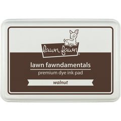
Walnut. A great name for this medium to dark brown. A touch lighter and barely a bit more yellow than it's closest companion in my collection, CT Doc Brown.
Black Licorice. This is a great black. I'm going to reach for it a lot. Since it is a dye ink, it works well with Copic markers. The coverage is nice, crisp, and even. I also noticed it was not as quick to stain as some other black inks do. When stamping a single image and cleaning right after there was no staining, but when stamping one image multiple times and not cleaning immediately after there was minimal staining.
Here is the chart I made for myself to sit right next to me on the craft table so I can easily tell which ink will be the perfect fit for my project. Lawn Fawndamentals are on the left, Color Theory on the right.
So there you have it! All ten of the new Lawn Fawndamental inks. Which inks will you be grabbing? Need a coupon? Use: TALKTOHEATHER for 20% off your inky Paper Issues order. Until next time, Heather.


Thanks for a great review! I've never used their ink but I just might have to buy a few!
ReplyDeleteThanks Janet. They were just released this year. Super fun!
DeleteGorgeous!
ReplyDeleteThey sure are all laid out and pretty. :D
DeleteThanks for doing this review!
ReplyDeleteHope it helps Janet!
DeleteAwesome review!
ReplyDeleteThanks Becky!
Delete